Duration
Jun - Aug 2023
Team
Autonomous Finance
Role
UX Design Intern
Internship Summary
At Fidelity, I helped inexperienced users start saving by designing flows that automate fund transactions into their accounts. Here’s a summary of what I did and the impact I had:
Project 1: Designed a set-up flow to automate savings for 529 (college) accounts
Reduced friction in users’ college funds saving experience
Created a reusable template for savings with a target amount and end date
Designed a new visualization pattern that projects total savings based on monthly contributions
Project 2: Explored a new savings program concept to add to the mix of existing programs
Designed and tested the validity of the program concept
Gained insights into user behavior and motivation, applicable to future program designs
Sprint: Designed an AI financial savings app with other interns (not covered in this case study)
And now, onto the details...
Product Overview
Smart Habits is a gamified way to automate savings and investments.
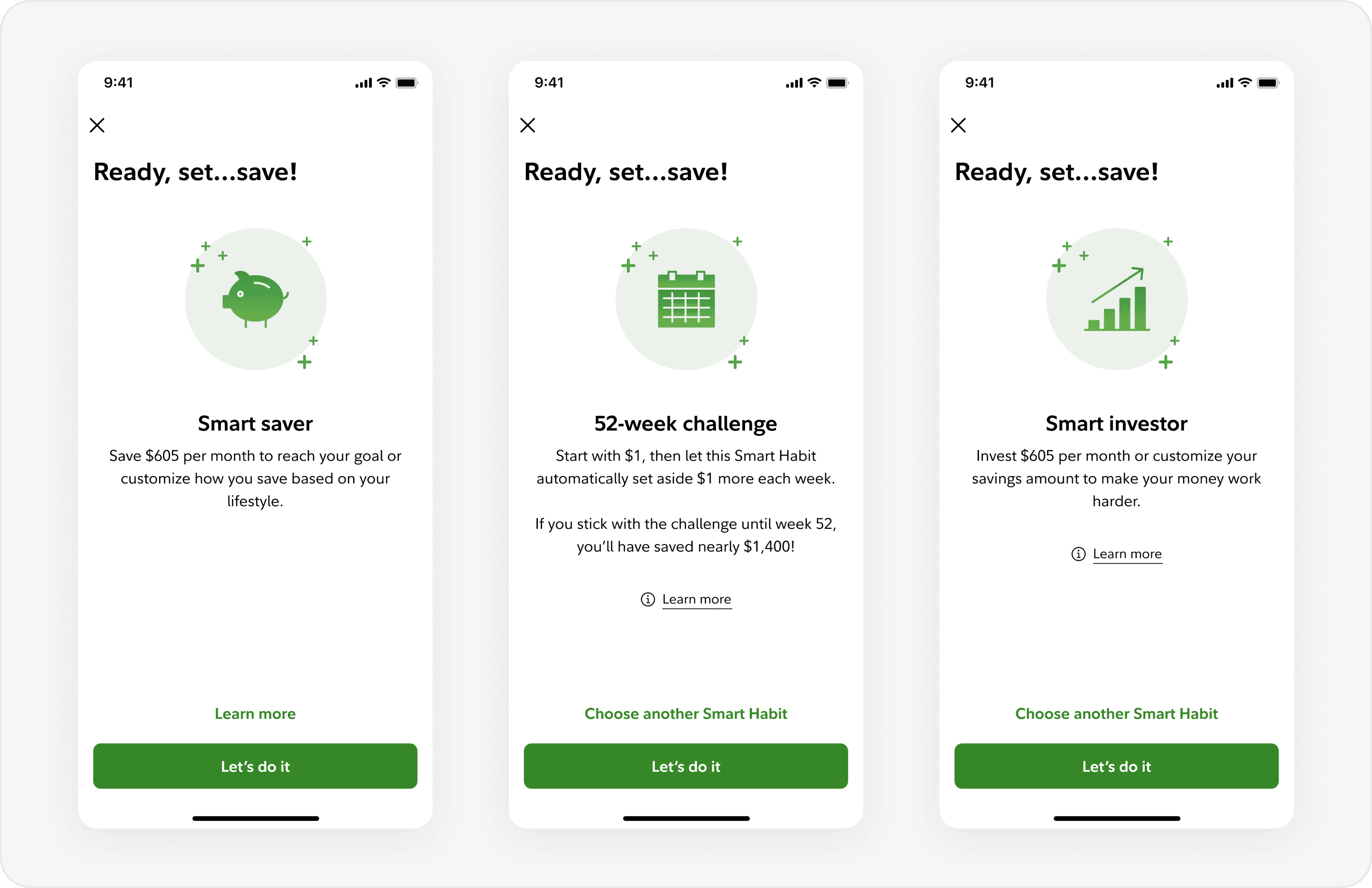
Smart Habits is a group of services that automate users’ savings into their accounts after an initial set-up process. For example, the “52-week Challenge” is a Smart Habit that transfers $1 a week, $2 the next week, etc. for 52 weeks into users’ accounts. Other Smart Habits - such as “Smart Saver”, “Tax-My-Spend”, and “Round-Up” - also increase savings incrementally and are currently in production.
My internship projects involved using these Smart Habits to design flows that helped users save more consistently and purposefully.
Project 1
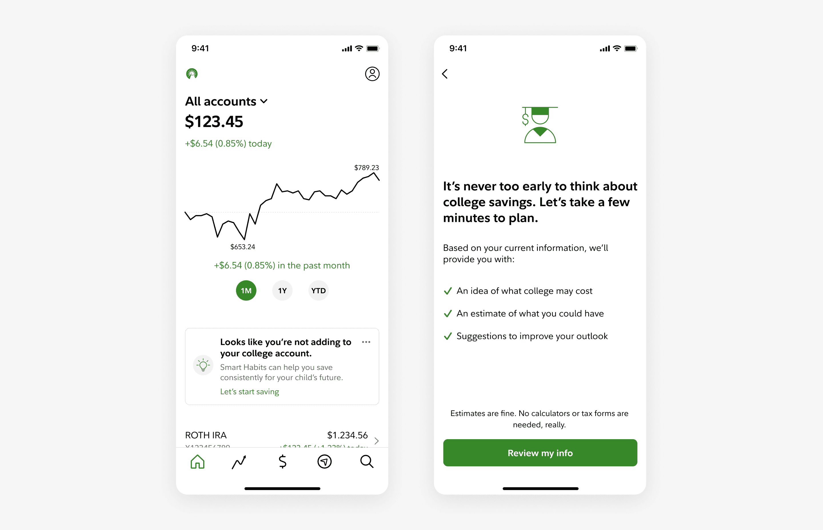
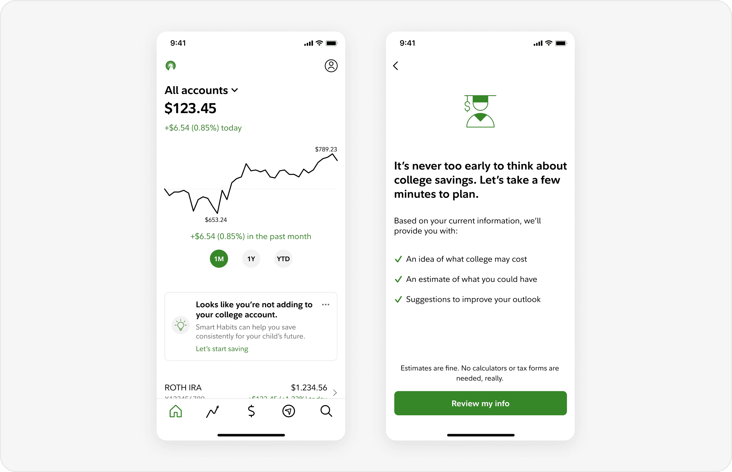
My first project involved designing a flow to automate college fund transactions into users’ accounts. While the team has created similar flows in the past, this use case required a separate, more specialized flow due to the complex nature of college planning. This took about 5 weeks to complete.
A lack of engagement with Fidelity’s financial planning tools caused by multiple, disparate set-ups required to start saving
Currently, 3 different planning tools exist: 529 accounts, college goals with a cost estimate calculator, and Smart Habits. Although each tool is necessary for effective college planning, because they exist separately, most users don’t capitalize on its synergies. In fact,
Fidelity has over 1.3 million 529 accounts, but only 4% have a goal attached to it, and only 2% have set up recurring funding for it.
This indicates a huge opportunity to help users save more effectively.
Research synthesis, goal-setting, high-level IA, and lots of iterations
The design process felt pretty typical. After synthesizing research, setting goals, and structuring the design flow in about 2 weeks, I went through multiple iterations for another 2-3 weeks.
I definitely missed the mark on how to go about this project at first - more on that below. It was a good experience anyway, and I’m glad to have learned from it.
Planning out the IA had the biggest impact on the efficiency of my workflow.
Before designing, I spent some time defining the users’ goals and the tasks that they would need to accomplish. Afterward, I created a flow chart to map out the information architecture, as shown below.
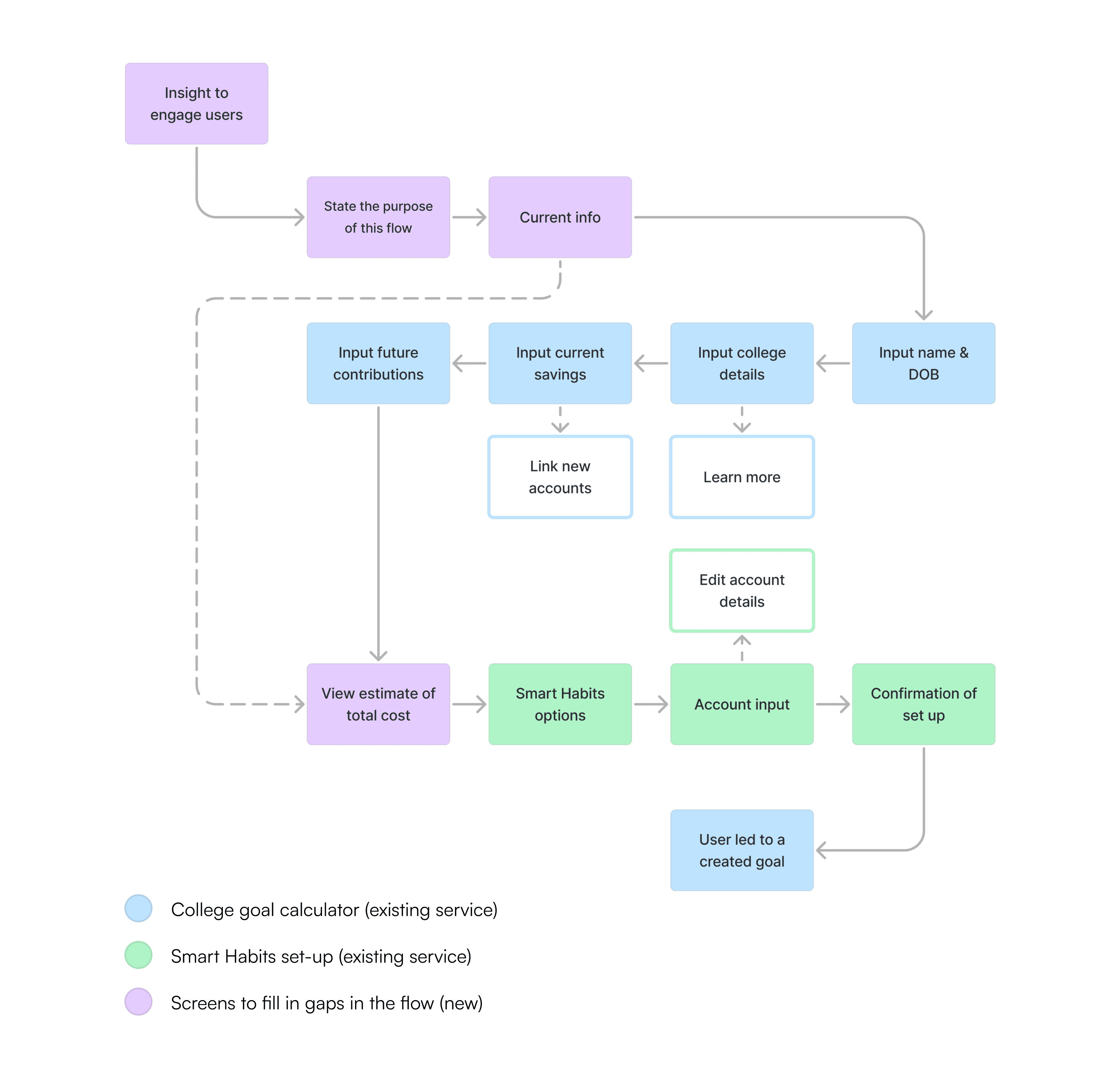

In hindsight, I should’ve spent more time on this step before moving onto iterating on Figma.
This step was crucial since the essence of the project was reusing existing flows to create a new flow. It was basically piecing existing screens together: fewer opportunities to design new features, but more emphasis on strategically moving parts around to optimize the experience. Because of this, working out the details at the flow chart level would’ve been more time-efficient than revisiting this step in Figma.
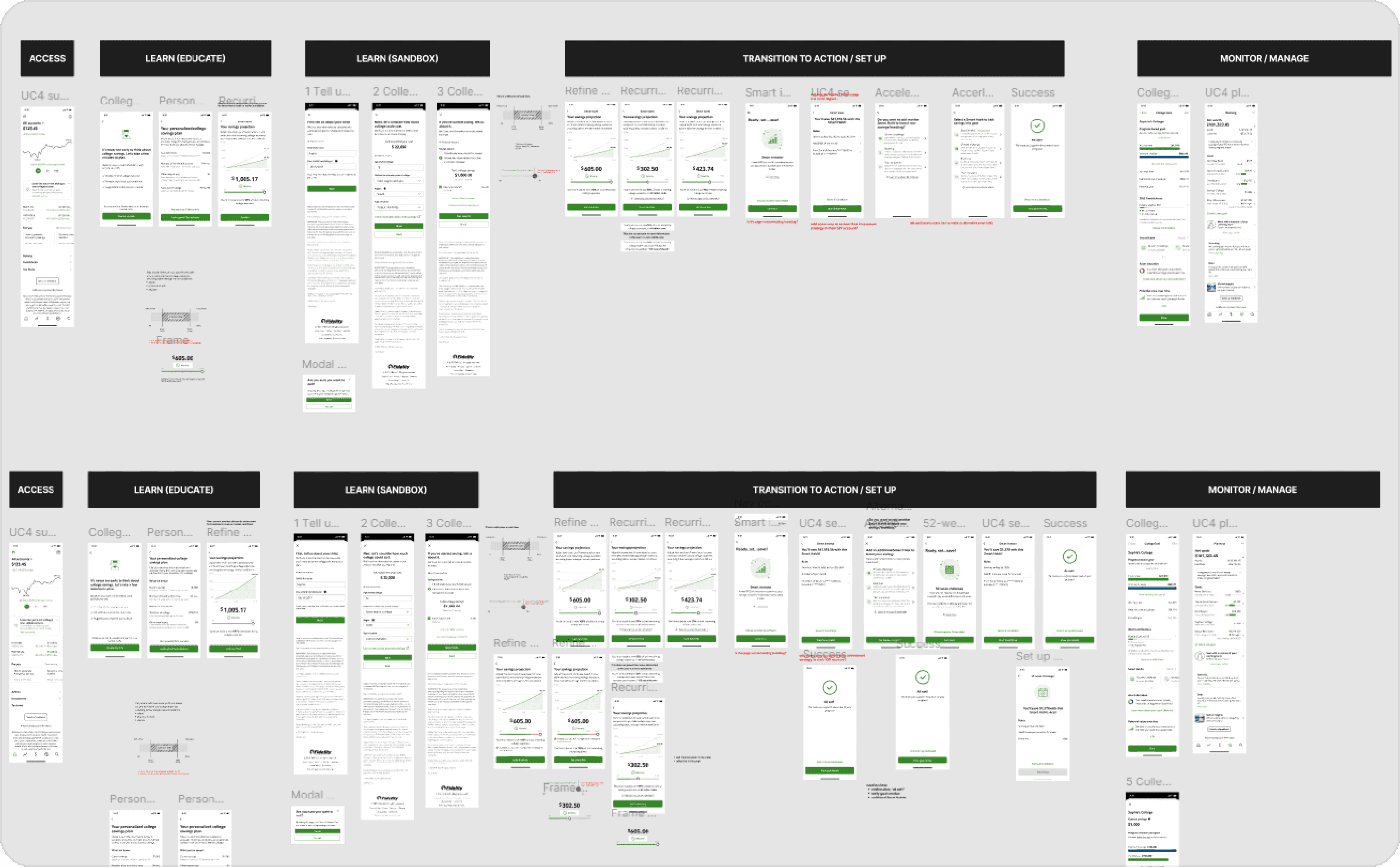
Iterations: Trial & error, stakeholder feedback, and improvements for the best experience
Regardless of some inefficiencies in my workflow, I improved my designs through a cycle of iterations and feedback from stakeholders. While the focus of my work carried over and were somewhat fluid at times, I iterated my designs in 3 main phases, setting different objectives for each, as shown below:
Phase 1: Link screens together
Phase 2: Address major user pain points
Phase 3: Optimize conversion

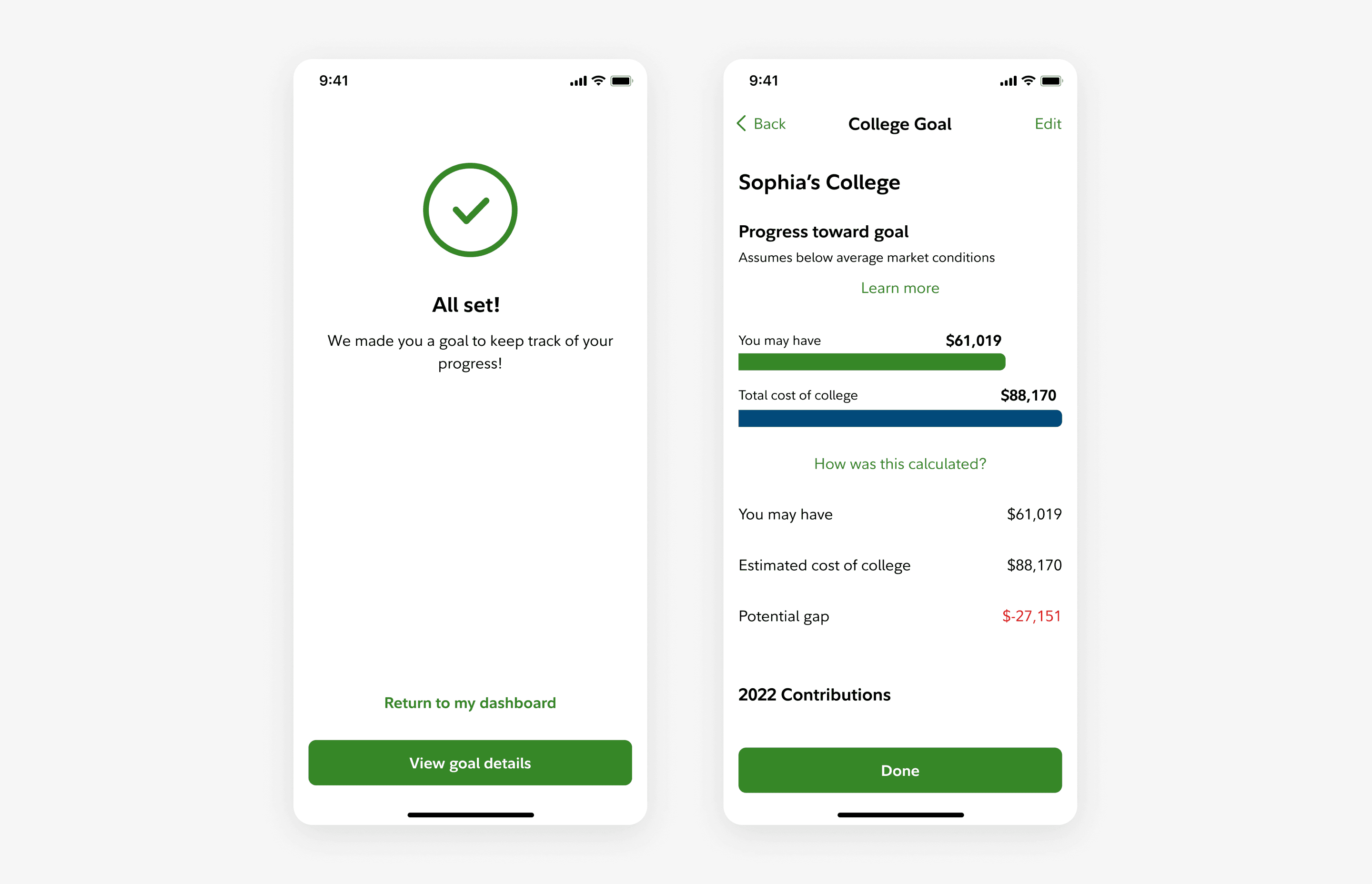
An end-to-end MVP of a Smart Habits flow that helps users plan for college in one set up
Here’s a demo of the full end-to-end set-up experience below:
And here’s a step-by-step process of users’ actions within the flow:
Users are initially drawn in and incentivized to take action with an insight card on the homepage.
Afterward, users can estimate their future expenses by interacting with the college goal calculator.
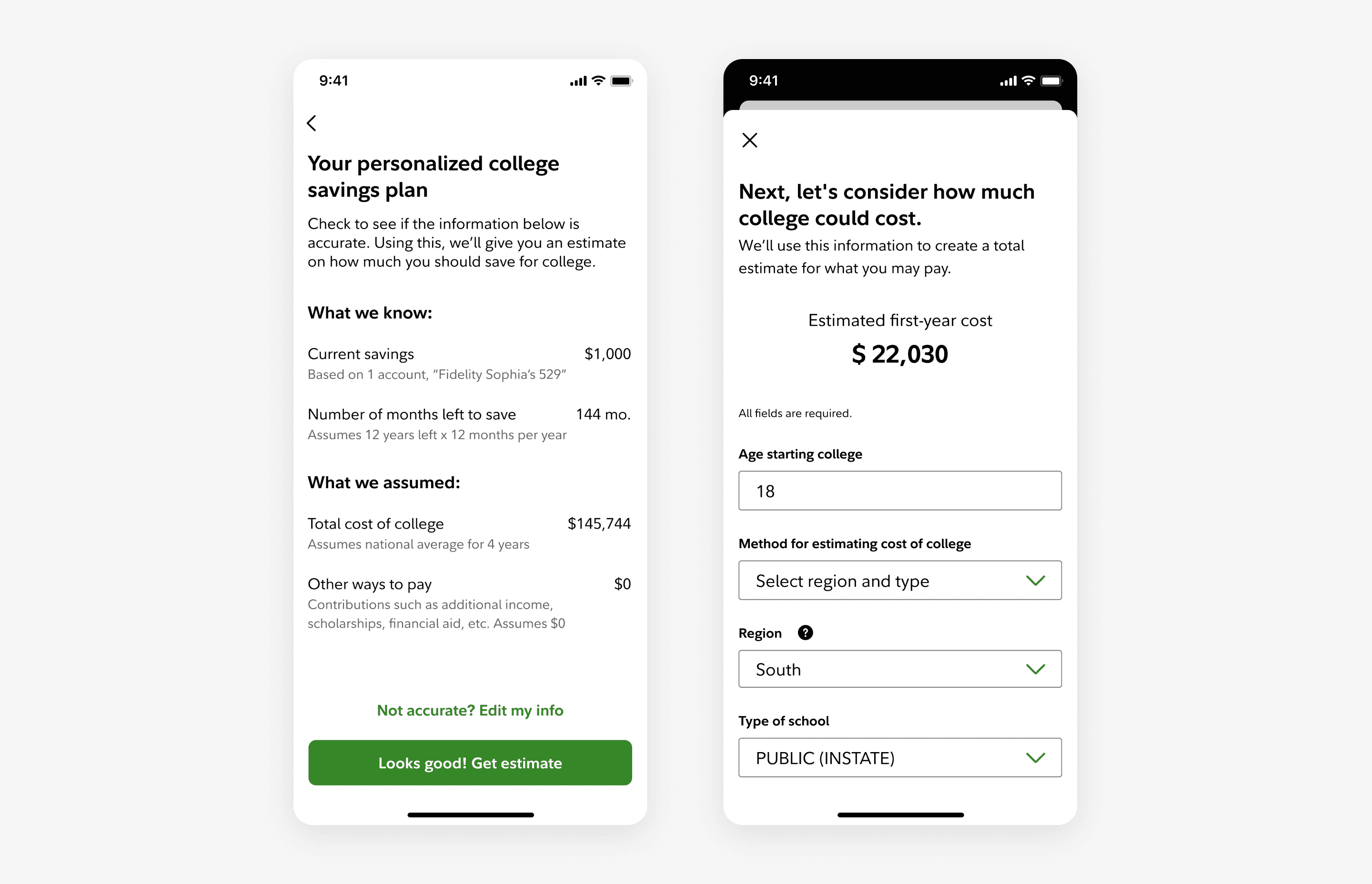
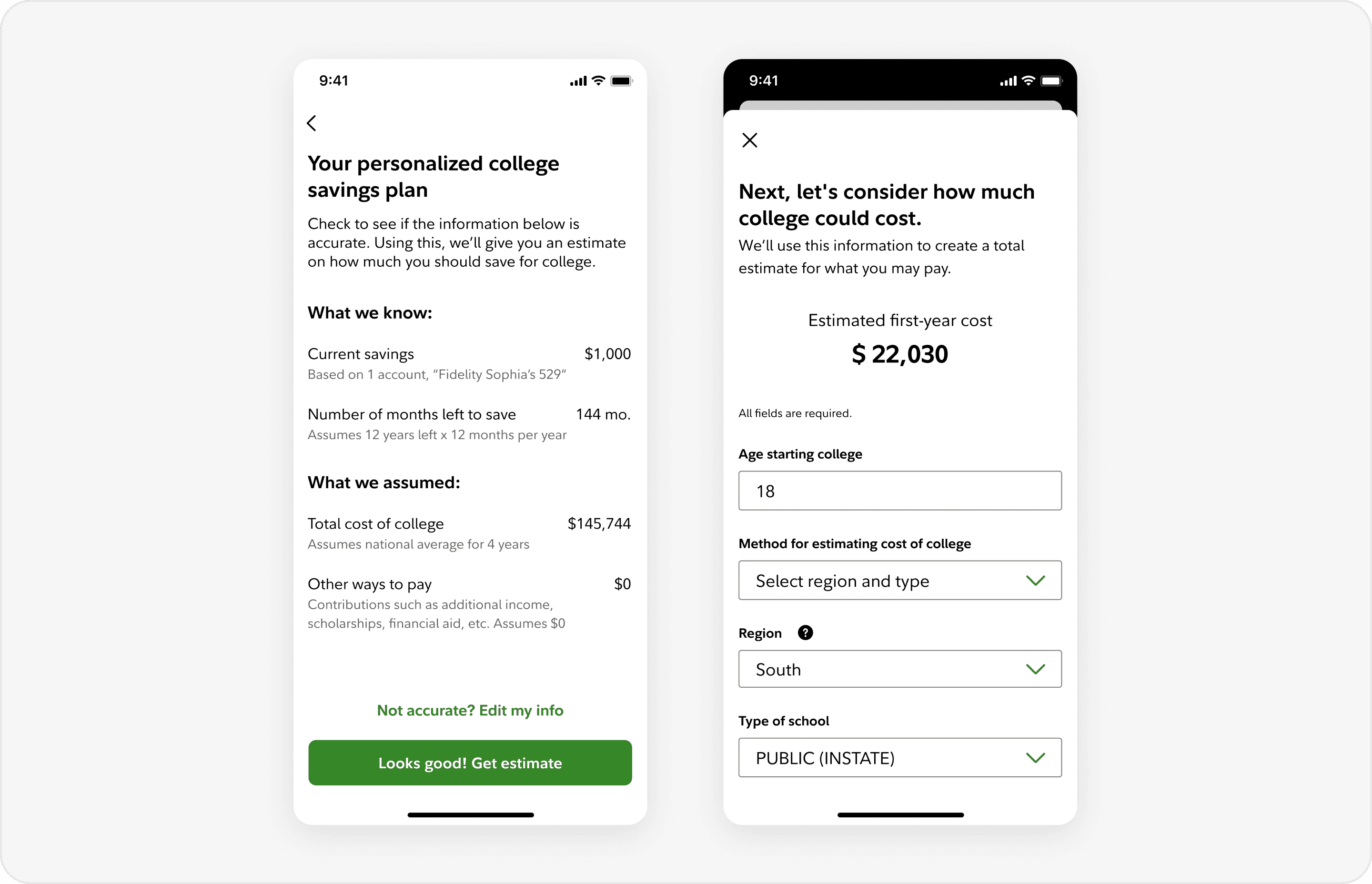
Using figures from the previous interaction, users can customize and visualize their saving details to meet their financial needs.
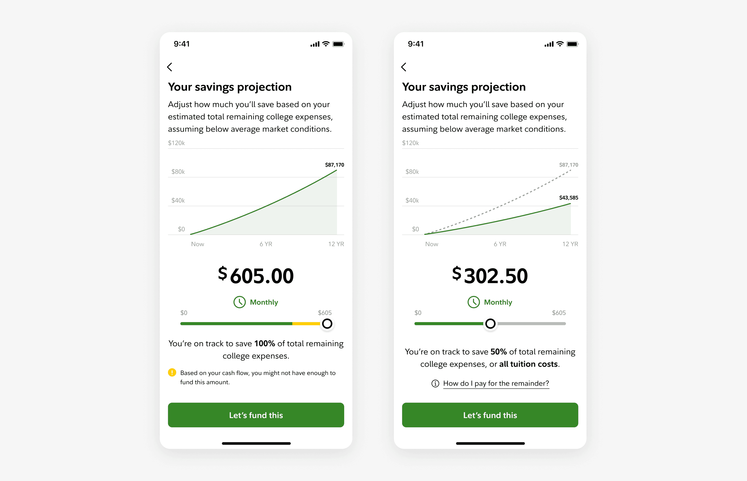
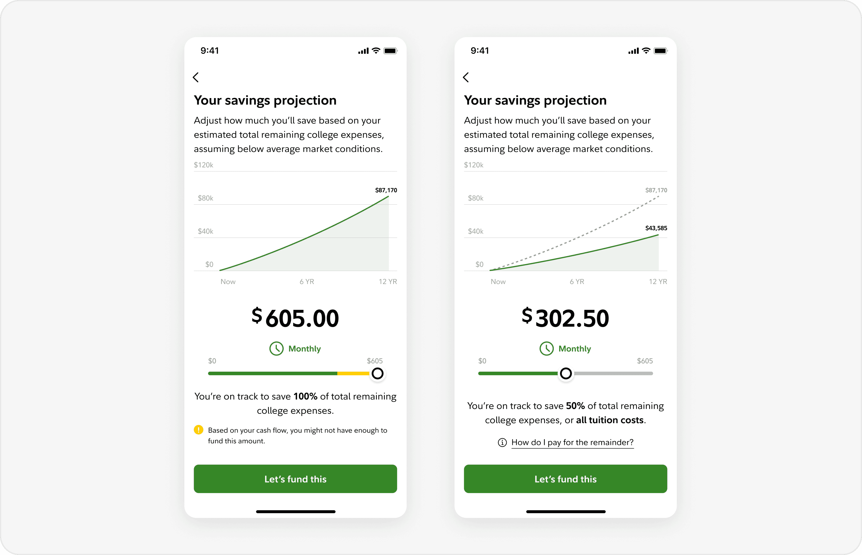
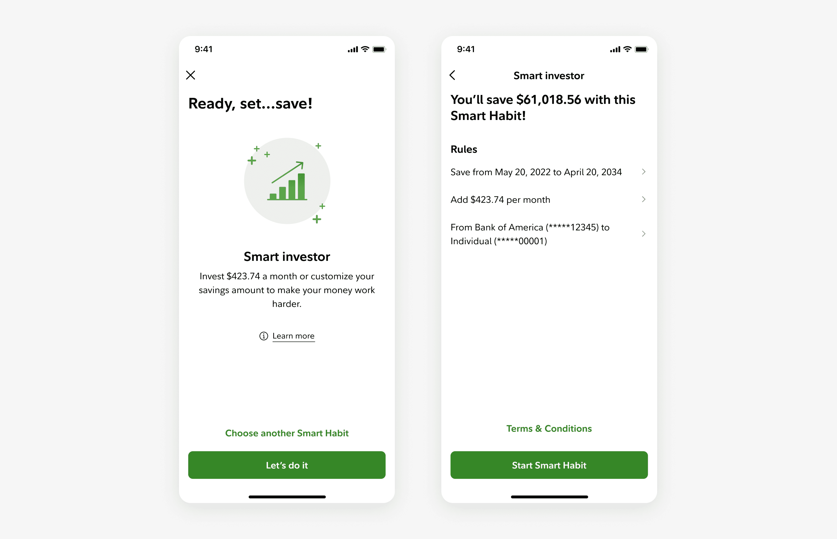
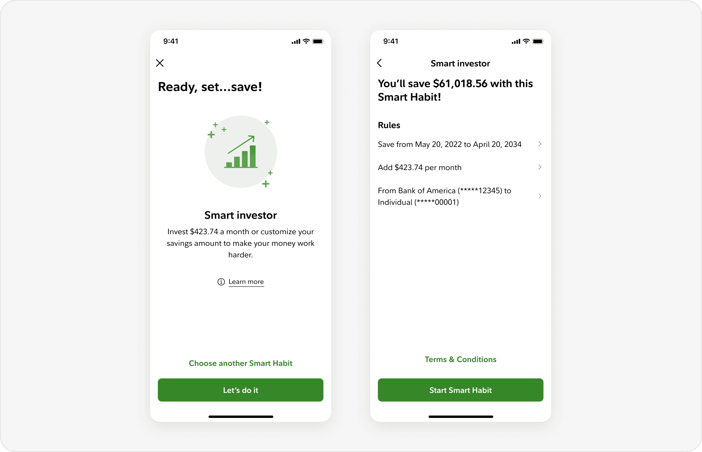
Once they’ve adjusted their monthly savings, users can automate the recurring funding process by setting up Smart Habits.
Finally, users can track their progress through a customized goal, set up automatically at the end of the flow.

Project 2
For the second half of my internship, I brought a new Smart Habits program concept, “Couch-to-5K”, to fruition by designing its set-up flow to test with users. This project took about 3 weeks to complete from ideation to synthesizing user interviews.
Different types of programs may appeal to different types of users, and we wanted to capitalize on the opportunity to serve as many users as possible.
Past research has suggested that users have different saving patterns/habits, and thus prefer a wider offering to select from. Since the AF Team was quite new at the time, it was experimenting with many different Smart Habits to release into the market. We mimicked some programs from our competitors, while others were just shot-in-the-dark, exploratory ideas to see what resonates with users.
To assist in this effort, I built out a program that my manager wanted to test out for some time. While it wasn’t really clear to see if users had problems with our existing Smart habits, there was a pretty clear opportunity to offer something different and fill the gap in our services, as shown below:

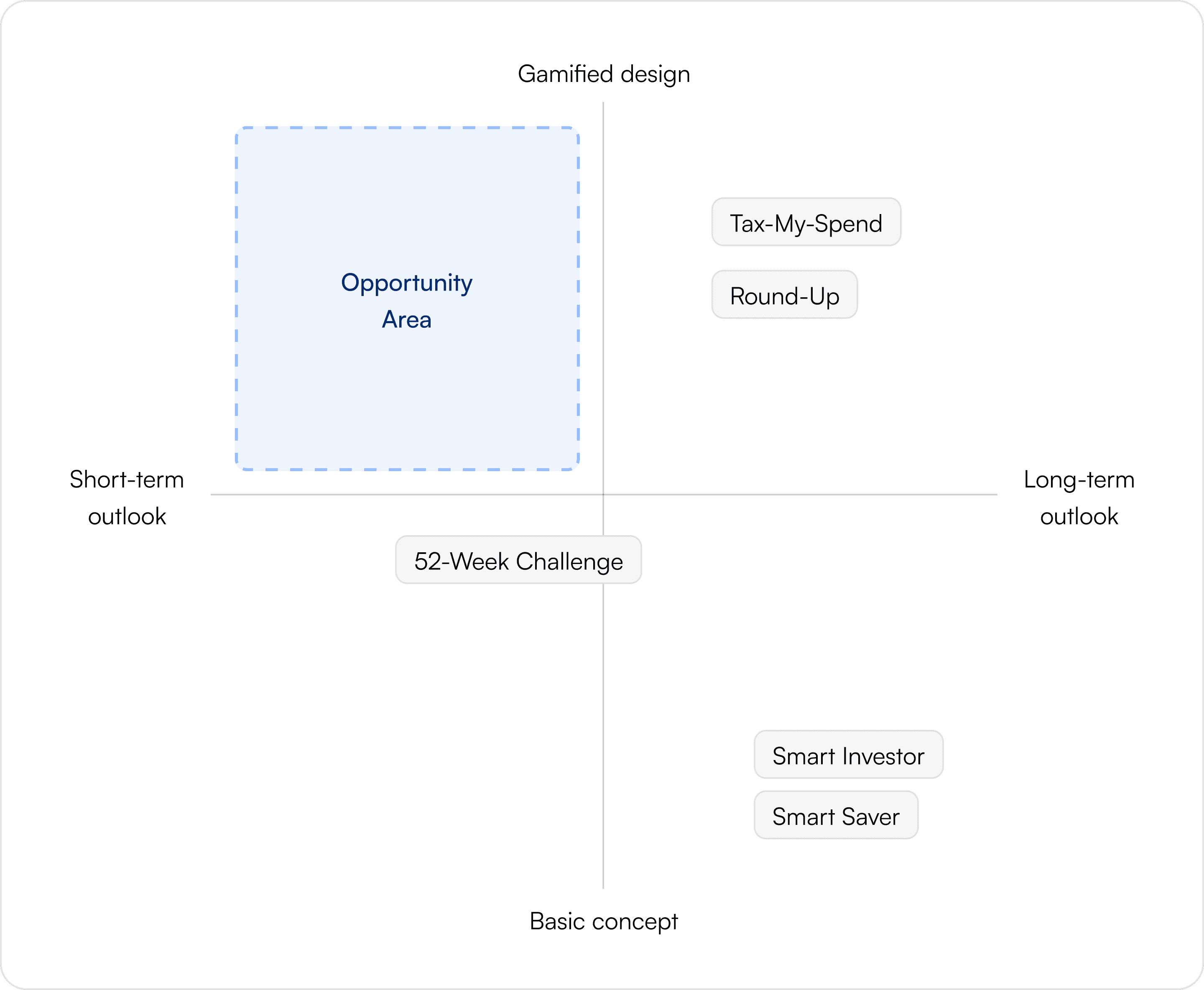
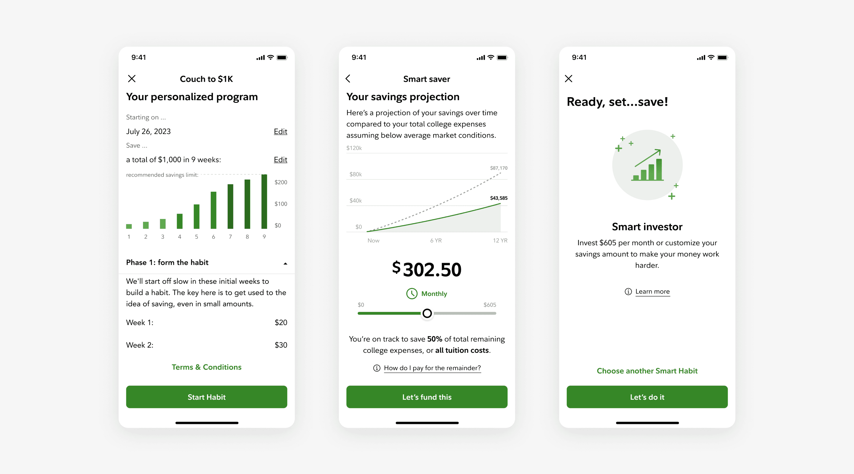
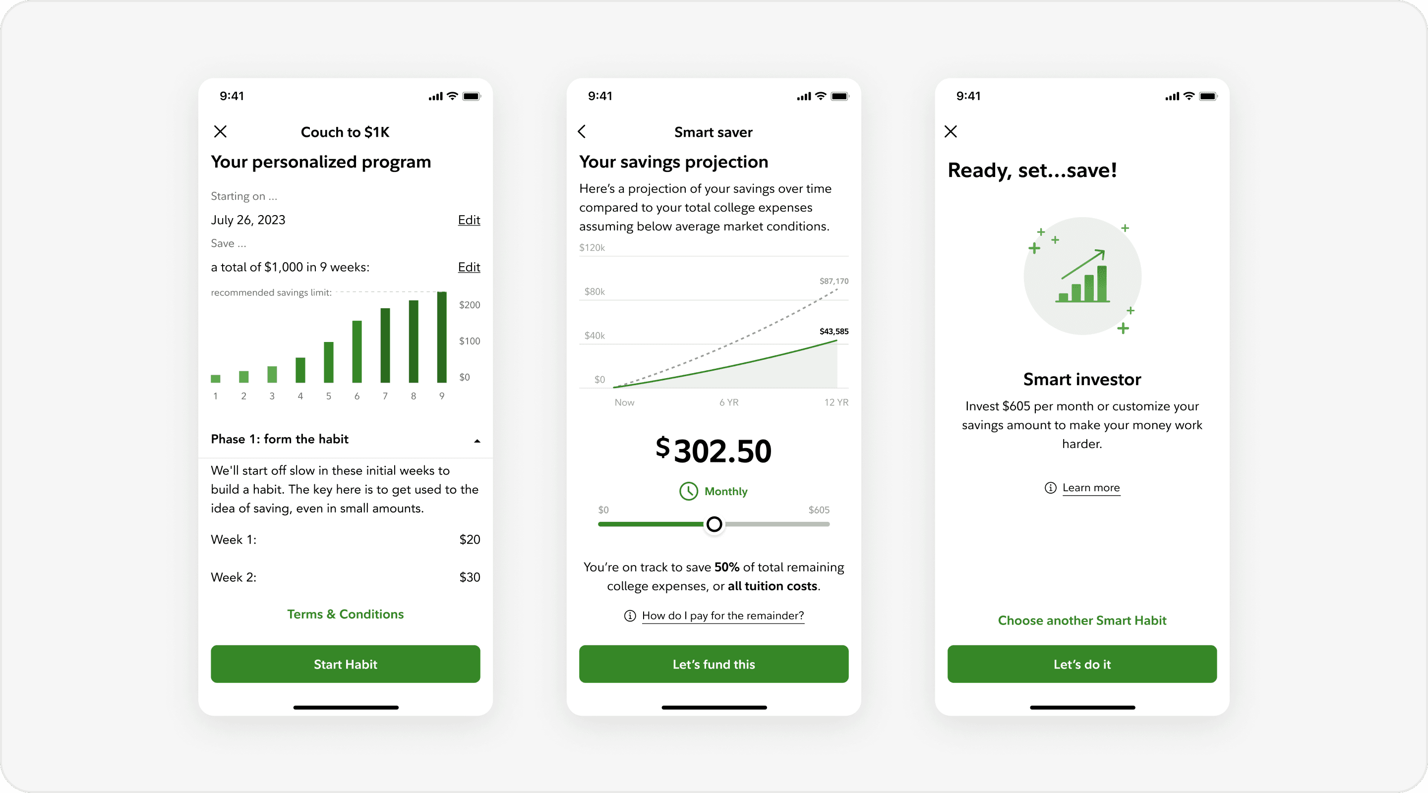
It’s a 9-week program that borrows some behavioral science principles from the (infamous) C25K running program.
Similarly to how the running program works, this program seeks to motivate users who are unaccustomed to saving by starting slow and ramping up their transactions each week for 9 weeks. For example, a user might save $20 on week 1 and incrementally build up their tolerance to save $220 on week 9. The goal at the end of the program is to help users save their first $1,000.
The novelty of C25K, behavioral science principles, and the idea of financial fitness
The novelty of the popular running challenge turned into savings will engage users.
Aspects of the behavioral economics used in C25K can be translated into savings.
The idea of “building financial fitness” will motivate users.
I was pretty skeptical at first. Translating running into savings doesn’t sound like it would really go hand in hand, and doing so successfully - saving $1,000 in 9 weeks - seemed quite idealistic.
Despite my suspicions, I designed the concept out to test with the users, as my team had a few hypotheses which could only be validated through user feedback. Here they are below:
Leveraging the existing Smart Habits flows
Since this program would be offered alongside existing Smart Habits, I didn’t have to rebuild the entire flow. Instead, I focused on designing 2 new screens which are unique to this specific program.
Sandboxing screen:
The main challenges with this screen were: 1 ) using the right patterns for intuitive adjusting, 2 ) laying out the information to match user expectations of the program design, and 3 ) guiding users on how much they should save. After exploring a few iterations, here’s what I used for testing:
Program detail screen:
The main challenges with this screen were: 1 ) explaining the program details intuitively, 2 ) fitting all necessary information in a confined place, and 3 ) figuring out the proper interactions of the choices that users can make. After exploring a few iterations, here’s what I used for testing:
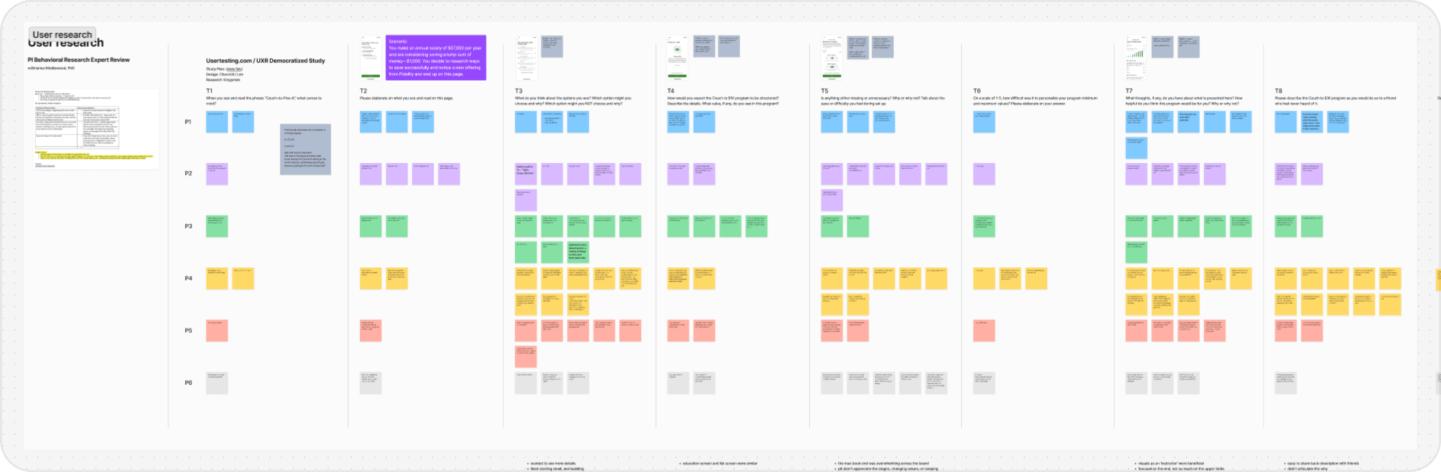
Conducting a concept test and a usability test in a single study
I tested our hypotheses on usertesting.com. By asking participants a variety of questions, the study killed 2 birds with 1 stone; it tested the validity of the program concept + the usability of the flow.
The concept received generally positive feedback. With a few tweaks, it might have potential.
Many participants resonated with the idea of “building financial fitness”. One point of improvement though, is to adjust the default savings to be less than $1,000 - they thought this was too aggressive.
Overall, the intent was there, but the execution needs adjustment. At best, this has potential with a few tweaks. At worst, at least we learned a thing or two about user motivation to leverage in future projects.
The usability of the screens was spot on.
Users liked the intuitive layout of the sandboxing screen and the visual interactions of the chart in the program detail screen.
Areas of improvement: explaining the concept earlier on, emphasizing the behavioral science aspect of this program, and helping users push past their comfort level
In general, users wanted to understand how the program worked much earlier than when it was presented to them. When they finally learned about it, they were particularly motivated by the idea of building good habits and wanted to start pushing themselves.
This presents a great design opportunity: HMW... inform users about the benefits of the program as quickly and effectively as possible?
Epilogue
Slow down and zoom out: Comprehend the problem, constraints, and resources in its entirety.
Especially in a big company, I realized the importance of understanding more than just the problem - business goals, resources, the team’s current work, etc. all build context, and absorbing this in the beginning helps to create a more efficient workflow and a more relevant, impactful solution.
Have a more fluid, open-minded approach to the structure of the design process.
I was pretty close-minded about the design process at the start of the internship, being more concerned about molding the project into a case study over doing what’s best for the project (oops). I’ve since moved away from this approach, since it’s not optimal for many projects - including mine - to blindly follow the typical design process.
Clear, proactive communication is imperative to success in the workplace.
A bit of a cop-out answer but also very true. In the second project, I had some hiccups in the timeline with user testing which could’ve been avoided if I asked anticipatory questions. This is also partly due to a lack of experience, but in general, you can never go wrong with being curious and proactive to communicate questions, concerns, and updates.